Hot diggity dash!
The Timely business dashboard has had a makeover, and it’s looking pretty darn good!
Now you can see how your business is performing, all in a series of beautiful charts and graphs. So it’s even easier to pinpoint areas of your business that are doing well, and areas that might need a little attention.
Let’s dive in!
Using the dashboard
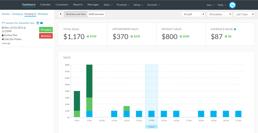
The new Dashboard is split in to three main options; Your Business Overview, Your Staff Overview and the Dashboard sidebar. The Business and Staff overviews can be filtered by date, staff and location. The coloured indicators show whether that total is up or down on the previous period.
Just click the “<” to open up the Dashboard Sidebar to view any recent Activity, accept or decline any Pending appointments and check out what’s Coming up. You can even see any customer birthday’s and send them a birthday greeting, straight from the Dashboard.

Sales performance
The first thing you’ll see on your shiny new dashboard is a sales summary for the period selected. This shows the Total Sales, Appointment Sales, and Product Sales, as well as the Average $ Value of your appointments. Handy change indicators show whether the total is up or down on the previous period.

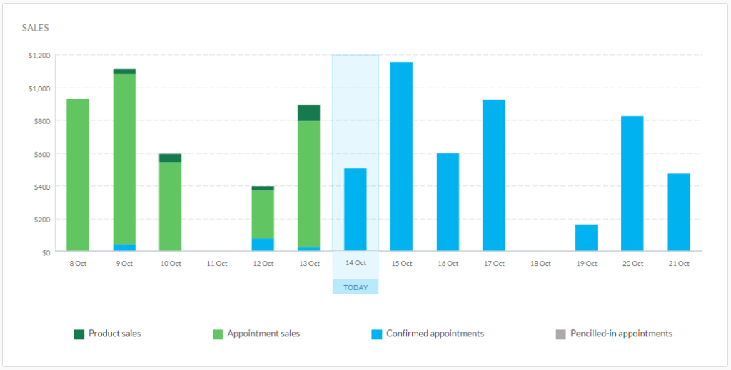
If you’re a visual person and prefer graphs, the Sales performance graph shows your sales performance day by day in a nifty stacked column graph. The current day is outlined in blue.

Your future value is shown using blue and grey – Appointment value shows the value of Confirmed appointments, and Pencilled-in value shows the value of appointments that are Pencilled-in.
As appointments are paid for during the course of the day, they are converted into green Service sales. Any products you sell are shown as Product sales. Simple eh!?
Customer insights and rebooking rates
The new dashboard also gives you useful customer insights, including how many customers were serviced during that period, and how many new customers walked through your doors.

We’ve completely overhauled our Retention and Rebooking calculations, so you’ll now see a handy donut for each. Mmm donuts!
Just to recap, this is what they show:
- The Retained figure shows the percentage of customers who are returning customers, i.e, customers that you’ve seen before.
- The Rebooked figure shows what percentage of your customers have booked a future appointment in the Calendar, i.e., they have rebooked their last appointment.
Productivity
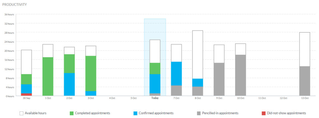
The productivity graph gives you a heads-up on how you’re spending your time by showing how much of your available time is made up of Completed, Confirmed, Pencilled-In and Did-not-show appointments.

If you have a large amount of available times that are not filled, why not try these tips for getting more bookings?
Staff dashboard
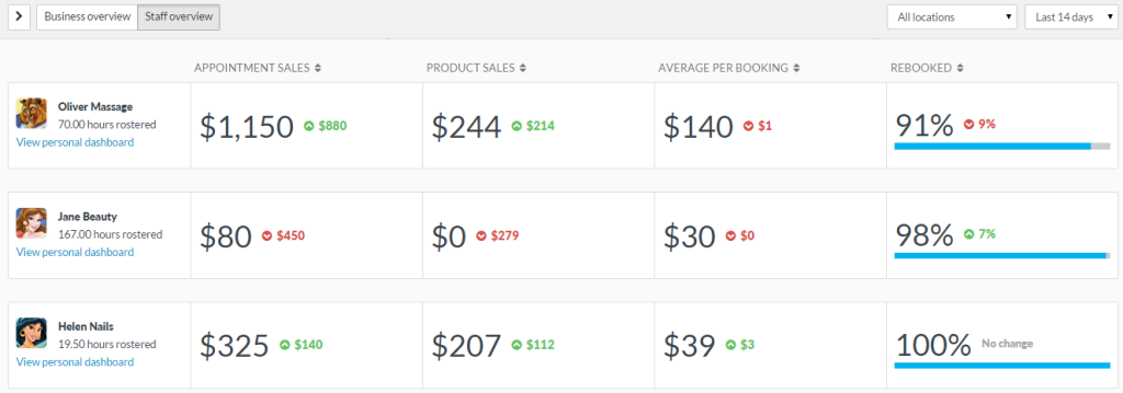
The Staff overview of the dashboard allows you to see at a glance how each of your staff are performing.

You can see the totals of your staff’s Service and Product sales, as well as the Average value per booking. Pretty nifty huh!?
You can also view a Business overview style dashboard for each of your staff by clicking View personal dashboard.
Access to the new dashboard
We’ve added some more access settings around the new dashboard too. If your staff already have access to the Dashboard in Timely, by default they will only be able to see their personal dashboard.
You can assign more access to your staff (e.g. to the Business overview) by going to Account > User access.


